
Logos can speak volumes, even for lawyers! In the realm of television, lawyer characters are a staple, and their branding, often seen in logos and business cards, is ripe for comedic interpretation. Think “Harvey Birdman, Attorney at Law,” or the infamously inept Lionel Hutz from The Simpsons – their logos are legendary for all the wrong, yet hilariously right, reasons. These aren’t just funny images; they’re satirical jabs at legal stereotypes, amplified through branding gone wonderfully wrong.
Lionel Hutz: A Sponge Business Card for a “Bargain” Lawyer
Lionel Hutz’s sponge business card is a masterclass in disastrously funny branding. “As seen on TV” and “Clogging our courts since 1976” – the slogans alone scream incompetence. It’s the kind of business card that instantly tells you everything you don’t want in a lawyer, making it perfect for a character whose legal prowess is as absorbent as his chosen card material.
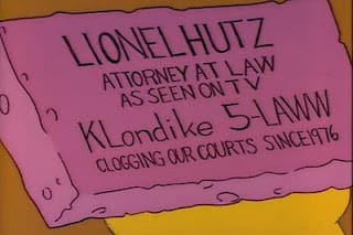 Lionel Hutz's sponge business card with slogans "As seen on TV" and "Clogging our courts since 1976"
Previously, we’ve explored the comedic genius of The Simpsons’ courthouse logo for Springfield Elementary’s Youth Court. Imagine a grammar school version of Judge Judy, presided over by Janet Reno (in cartoon form, of course!), where the balanced scales of justice are replaced by a children’s teeter-totter!
The Teeter-Totter of Justice: Simpsons’ Visual Gag
A see-saw representing justice? Pure comedic brilliance. The visual gag is instantly understandable and perfectly encapsulates the childish, and perhaps skewed, sense of justice in a school setting. It’s this kind of clever visual humor that elevates cartoon logos from simple images to insightful social commentary.
![]() Simpsons Youth Court flag logo featuring a teeter-totter instead of scales of justice
Simpsons Youth Court flag logo featuring a teeter-totter instead of scales of justice
Another classic example of humorous branding comes from the 1965-71 TV show “Green Acres.” This sitcom features a high-powered New York City lawyer who trades his briefcase for a tractor, moving to a rural community to become a farmer, much to the dismay of his glamorous wife, played by Eva Gabor.
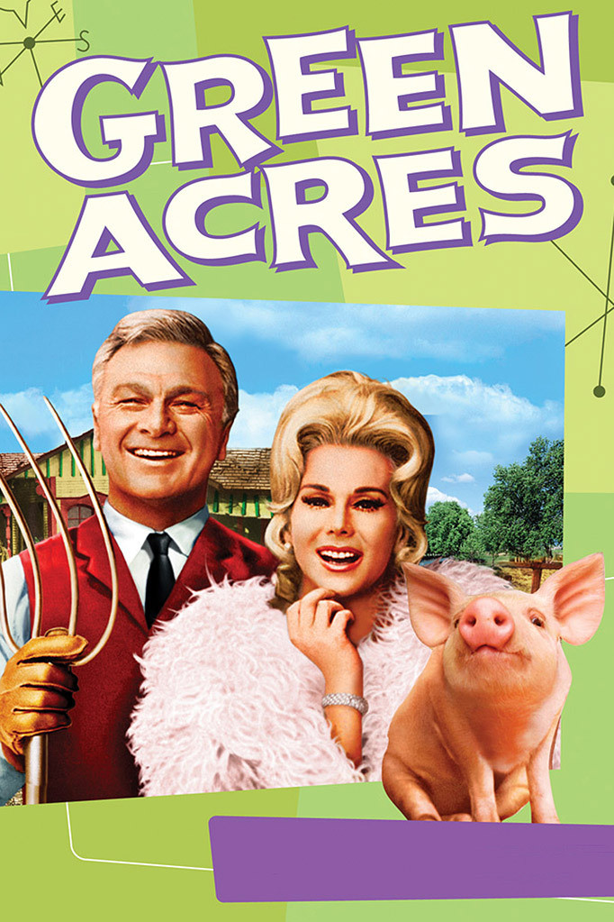 Image from the Green Acres TV show featuring Oliver and Lisa Douglas
The humor extends to the very name of the law firm the protagonist leaves behind: Seven three-name partners: Felton, O’Connell, Clay, Blakely, Harmon, Dillon, & Pastor. And the sole, seemingly less important, associate? Our hero, Oliver Wendell Douglas. This joke, delivered simply through the firm’s name on a door, speaks volumes about hierarchy and the often-unseen individuals within large organizations.
From Birdman Lawyer to Beyond: The Power of Logo Humor
From the exaggerated branding of “Birdman Lawyer” Harvey Birdman to the subtle joke in the “Green Acres” firm name, these examples highlight how logos, even fictional ones, can be powerful tools for humor and satire. They play on our expectations and understanding of the legal profession, twisting them for comedic effect. These logos, while intentionally bad, are undeniably memorable, proving that in the world of TV law, sometimes the worst branding is the most impactful.
Looking for real-world legal marketing expertise? Contact us for advertising, branding, website design, marketing training, and CLE presentations.
Download a free legal marketing strategy book here or purchase it on Amazon.
[